

5 things to consider when building a member portal
by Nadia Lupton
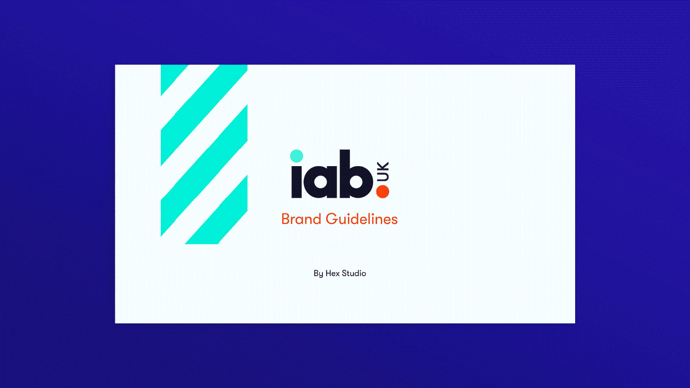
Be they 10 or 100 pages (though hopefully closer to the former…), brand guidelines are important in formalising and protecting your brand’s identity. When created and stress tested properly, they provide the blueprints for designing any new piece of work that will then fit into your existing assets.
Although the full scope of what different guidelines need to cover varies, there’s always some basics that shouldn’t be missed…
Surprisingly often overlooked. A short intro should give any reader a good sense of your brand and what the rest of the document entails. Take time with this — your guidelines should inspire great work, so although practicality and brevity are key, a considered opener can make a big difference.
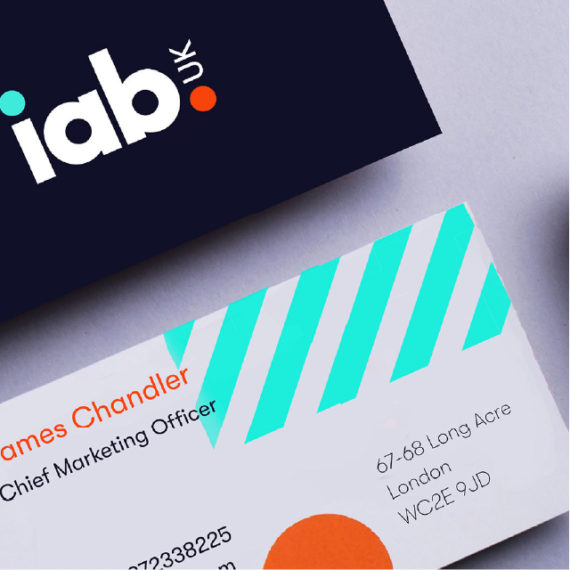
A good logo will be consistent across various formats, but may need some flexibility in order to do this. Usage guidance should set the rules on things such as clearance space, single vs multi colour options, its use with or without a strap line, and when to use which version.
Just as importantly it should be explicit in variations that should not be used — from putting text at a different angle, using secondary or alternative colours, or applying drop shadows (please, never)… the don’ts included should be just as explicit as the do’s.
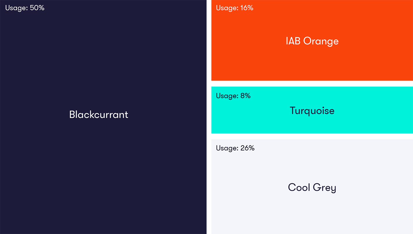
Colours and their use can be as recognisable as logos when used in a consistent system. Practical guidelines should not only include standard colour format references (CMYK, RGB, Pantone), but also detail and show examples of the full system in use — ideally noting primary, secondary and percentage application.
Brands with accent colours should be especially mindful here; it can be tempting to go wild with a fun accent tone above and beyond its usage guidance. Additionally if you’re dabbling in specialist neons or metallics, you’ll need extra guidance on how you create the same colours in print vs. digital.
Type choices again can be instantly recognisable for brands, so clearly laying out rules for your headline and body fonts is a must. Detail is key here, especially if multiple studios or agencies are working across your brand, so ensure you have clear and concise rules for:
A sense of how you communicate should be given throughout your guidelines, after all they are the written embodiment of who you are. Specific direction on what you are and aren’t, indications on a scale of x to x, or even likenesses to other notable brands or famous figures is useful for creating future copy. A minimum requirement for this should be 4–5 words that you are — straight forward, confident, informed for example; with further detail perhaps including examples of consumer facing lines you think best execute this.
Lastly you should include guidance on treatment and use of secondary assets like graphic elements and photography. This section length will differ pending on what your brand suite includes, but should consider things such as opacity, gradients, application of text and how to use patterns or textures.

by Nadia Lupton
by Nadia Lupton

by Ellie Mann